
When I was considering an app I use every day that could use design improvements, my mind went to Instagram, amazon, then school. I know many college students, specifically at JMU, use Canvas every day for classes. School is a big part of all of our daily lives as college students. The apps we use to organize and manage all the different information for each class are important when it comes to staying on top of work and keeping good grades.
Design Question
How might the canvas app be redesigned to allow students to easily access their classes and schedule?
Major Pain Points
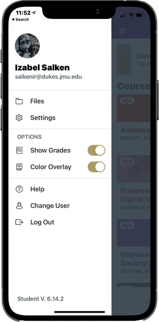
> My first focus for this project was improving the sidebar navigation on the canvas app and website. The app is currently set up so that when you click the sidebar you are presented with different options, but none of them are truly “useful”. I find myself clicking that sidebar when I want to get back to my dashboard, which is where classes are displayed.
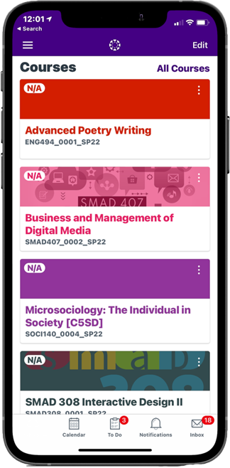
The next pain point I wanted to focus on was the way the app lacks a scheduling feature. Students can see their classes on the dashboard but important things like class times and room numbers aren’t featured on the app. When I want to see my class schedule that lists those things I have to go to Mymadison which has more steps involved and is only available in a web browser.
The Users
Canvas users consist of students and teachers in universities and colleges across the U.S, some high schools even use Canvas as well. The users I will be focusing on for this project will be college-aged students ranging from ages 18 to 22. These users will be people who use Canvas roughly every day for school and all are full-time students with pretty busy schedules.

User Research
I conducted my user research through online surveys that I distributed virtually to 19 people that go to JMU ranging from freshmen who are new to the app to 5th years with more experience using Canvas.
I wanted to start my research by determining how often students are using the Canvas app in their everyday routine. As I suspected, nearly every one of my participants answered yes when asked if they use canvas for all of their classes. This confirmed the idea that Canvas was basically essential to college student’s everyday routines. This makes it even more important for the app to be as user friendly as possible.
I was curious what features students were using the most on the Canvas app. 85% of my survey participants said they used the dashboard feature the most and 15% said they used the to do list more. The dashboard feature shows each class the student is enrolled in. I also use this feature the most, clicking back to see the list of classes I have to choose from. The to do list is also useful and important because it is the closest thing canvas has to the schedule concept I want to create for the app. The issue with both the to do list and the dashboard features is that class times are not displayed or teacher names and class room numbers. This is important to note because multiple of my participants mentioned wanting to see their class times or some sort of schedule when I asked what features they would like to see on the app.
The last question of the survey I left open for the participants to write in a feature they would like to see on the Canvas app. I found a common trend in all the responses were involving scheduling and class times. I was suprised and pleased to see more people than I thought had interest in the schedule feature and class times.
My Redesign
For my redesign of the sidebar I wanted to keep most of the old components but add the clickable list of classes. Having the classes in the sidebar solves the issue of having to click through all of your previous pages to get back to another class. Now the user can click the sidebar to access essentially a smaller version of the dashboard. I moved the settings button to the upper right corner of the sidebar. I added a schedule button near the bottom where the user can access the schedule page I created. The schedule page will be similar to the feature on Mymadison. The user would be able to see a timed schedule for each day of the week that displays times, location, and class name.
The original canvas bottom navigation only had the icons from the calendar over, so I decided to add the schedule icon there as well. It fit in perfectly, and I think it helps tell the user the schedule and calendar are different. I would keep canvas’s calendar feature the same, as it only lists things that show in the to do list. The schedule section would be different because it only shows what class is happening at what time.
User Flow

Wireframes

Final Design Mockups

Conclusion
After doing some user research i quickly realized other students felt the same way i did about the canvas app. Generally most students think the app is just “ok”. I was surprised at how many other students also valued the class times being displayed as well as the locations. It was interesting to see others share the same pain points as me within the app. I was happy with the results i got from surveying various students and how my app redesign turned out. I think the simple changes to the sidebar make a huge difference in usability and convenience.